Now our focus will shift to multiple regression (i.e. linear regression with >1 predictors), as opposed to simple linear regression (linear regression with just 1 predictor). Simple linear regressions have the benefit of being easy to visualize, and this makes it much easier to explain different concepts. However, real-world questions are often complex, and it’s frequently necessary to account for more than one relevant variable in an analysis. As with the last two posts, we’ll stick with the Palmer Penguins data, and now that they’ve been introduced, I’ll be using functions from the {broom} package (such as tidy(), glance() and augment()) a bit more freely.
updating our basic model
Let’s start by looking at the basic model we’ve been working with up to now.
library(tidyverse)
library(palmerpenguins)
library(broom)

fit <- lm(bill_length_mm ~ flipper_length_mm, data = penguins)

# check the coefficients
tidy(fit)
## # A tibble: 2 x 5
## term estimate std.error statistic p.value
## <chr> <dbl> <dbl> <dbl> <dbl>
## 1 (Intercept) -7.26 3.20 -2.27 2.38e- 2
## 2 flipper_length_mm 0.255 0.0159 16.0 1.74e-43# extract the residual standard deviation
sigma(fit)## [1] 4.125874ggplot(penguins, aes(x = flipper_length_mm, y = bill_length_mm)) +
geom_smooth(method = "lm") +
geom_point() +
labs(x = "Flipper Length (mm)", y = "Bill Length (mm)")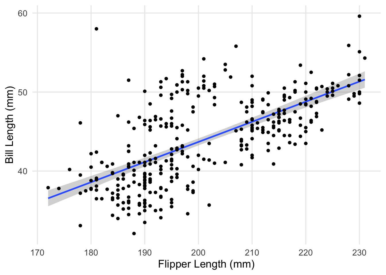
The plot shows pretty clearly that there’s a positive association between our two variables. However, you can clearly see that our line is missing a little cloud of points in the upper middle of the plot. Additionally, the spread of penguins with bill lengths less than 40mm and flippers between 180 - 200mm also don’t seem to be well explained by our line. Characteristics like this contributes to a higher residual standard deviation, which in this case is about 4.1mm.
This was something I had alluded to in part 1, but the explanation is straightforward: our data actually contains measurements from 3 different species! While there are some outliers (such as the particularly long-nosed fellow up in the top-right, and the adventurous Adelie that’s hanging out with the Gentoo), the groups are pretty distinct, and don’t overlap too much. It also looks like the relationship between our original two variables is still apparent within each of our groups.
ggplot(penguins, aes(x = flipper_length_mm, y = bill_length_mm, color = species)) +
  geom_point() +
  theme(legend.position = "top") +
  labs(x = "Flipper Length (mm)", y = "Bill Length (mm)", color = "")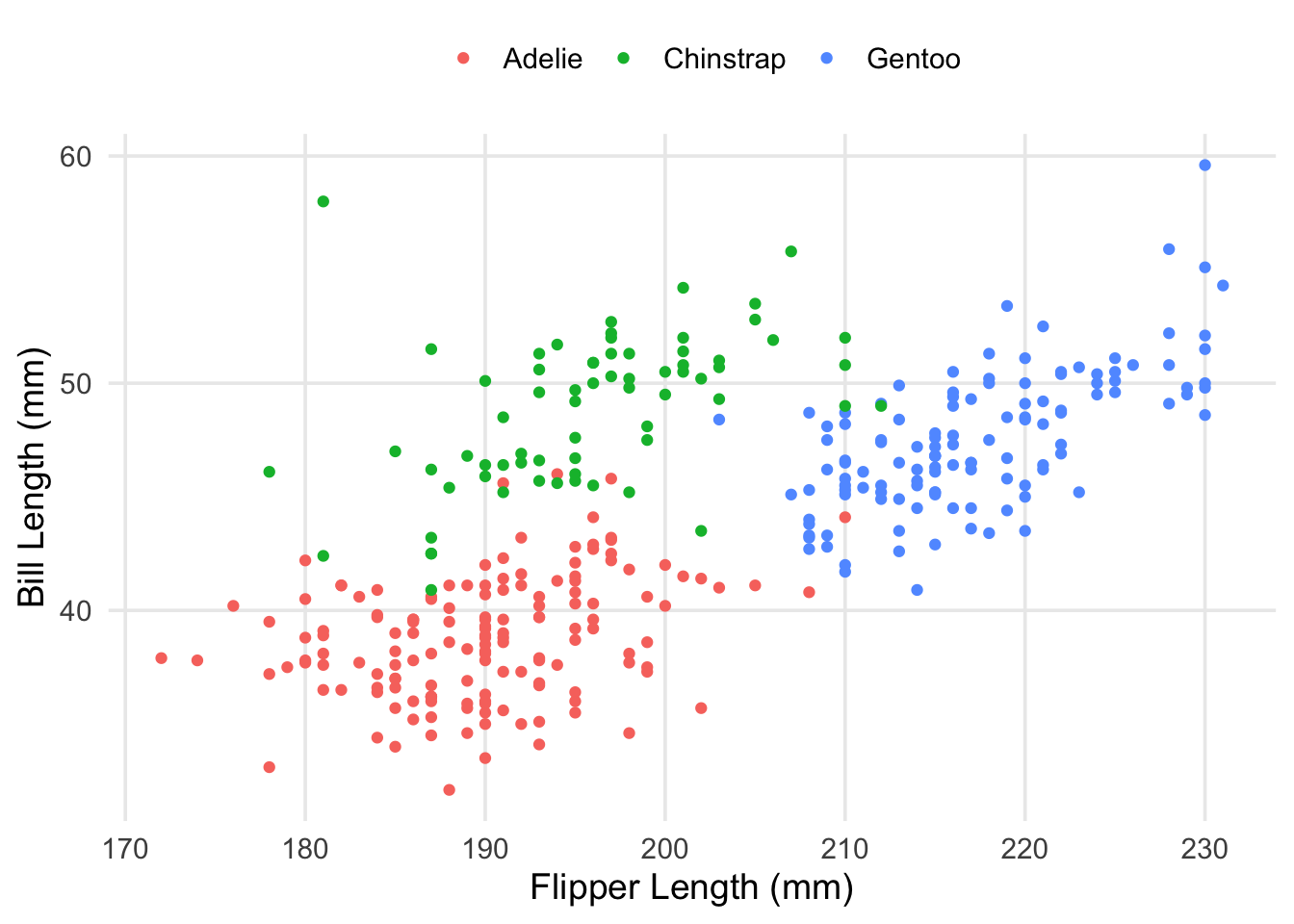
Now that we’re aware of this relationship, a logical approach would be to introduce an adjustment that accounts for the patterns we’re seeing. For example, the average bill-length of the Chinstrap penguins seems to be about 50mm, compared to the overall mean, which is maybe between 44 and 45mm. Multiple regression allows us to represent this in our model in a straightforward way. We’ll create a new model, adding our new predictor to the formula using a + sign. Then, we’ll take a look at the estimated coefficients.
fit2 <- lm(bill_length_mm ~ flipper_length_mm + species, data = penguins)

tidy(fit2)
## # A tibble: 4 x 5
## term estimate std.error statistic p.value
## <chr> <dbl> <dbl> <dbl> <dbl>
## 1 (Intercept) -2.06 4.04 -0.510 6.11e- 1
## 2 flipper_length_mm 0.215 0.0212 10.1 3.12e-21
## 3 speciesChinstrap 8.78 0.399 22.0 3.39e-67
## 4 speciesGentoo 2.86 0.659 4.34 1.90e- 5Okay, now we have a few new coefficients in our model, specifically new rows for our Chinstrap and Gentoo groups. Your first question might be: “What about the Adelie? Are they missing?” No, they’re still in our model, but you might say they’re being held as a contrast against the other two species. Under the hood, R is creating indicator variables (columns that give each observation a 0 or 1 based on some criteria) that are then used as predictors in our model. When working with non-numeric data (like the name or group membership of a species of animal), we have to represent that information in a way that our formulas & computers can use. When we put a categorical variable into a formula, like we did here,
bill_length_mm ~ flipper_length_mm + species
R generates the necessary indicator columns automatically, and includes them as predictors.
Thus, we end up with something like this:
bill_length_mm ~ flipper_length_mm + speciesChinstrap + speciesGentoo
Here’s what these indicator variables look like for 3 penguins (one from each species). Given that we have 3 groups/species, we can identify membership using just 2 columns. Each unique combination of rows corresponds to a different group.
contrasts(penguins$species)## Chinstrap Gentoo
## Adelie 0 0
## Chinstrap 1 0
## Gentoo 0 1So, to answer “where” the Adelie are, their rows are identified when the speciesChinstrap and speciesGentoo columns are both equal to 0.
interpreting the estimated coefficients
Until now, I’ve held off on discussing in-depth on how to interpret the results from a regression. In the case of simple linear regression, we’ve been able to talk about \(\hat{\beta_1}\) as the slope for the best-fitting line between two variables. This interpretation remains valid for multiple regression, but obviously gets more complex as the number of variables increases. You can represent two variables on an X-Y plane, but when you have 3, 4, 10 different variables & their respective associations? The betas then describe slopes on a multidimensional surface that’s hard (if not impossible) for us to visualize in a sensical way. In our case, it can still be tractable, but first we’re going to focus on the model’s representation as an equation.
Here’s our simple model:
\(\widehat{\text{bill length}} = -7.26 + 0.255(\text{flipper length})\)
And our updated model:
\(\widehat{\text{bill length}} = -2.06 + 0.215(\text{flipper length}) + 8.78(\text{speciesChinstrap}) + 2.86(\text{speciesGentoo})\)
Now, let’s imagine feeding these models some new data. Let’s start by thinking about what the intercept is doing in both equations. Is it something that’s directly meaningful? No. If we somehow had a bird with flippers of length 0, our models would predict a bill length of -7.26 and -2.06, respectively. In any regression model, the intercept value will be the model’s prediction if all the predictors in the model were set to 0.1 For the non-intercept terms, if you’re interested in variable \(x_k\), you can read its coefficient \(\hat\beta_k\) as the expected change in \(\hat{y}\) when increasing (or decreasing) the value of \(x_k\) by 1. Note this is the expected change holding all the other variables in the model constant. That is, if I set all the other variables to something pre-specified (such as 0), and only change my input for \(x_k\) by 1-unit, I’ll see \(\hat{y}\) move in a single increment of \(\hat\beta_k\).
The idea of holding other variables “constant” might become clearer as we generate predictions for some example penguins. As a practical example, let’s see what our models would predict for an Adelie penguin with a flipper length of 190mm. Plugging in this information gives us:
\(41.19 = -7.26 + (0.255*190)\)
\(38.79 = -2.06 + (0.215*190) + (8.78*0) + (2.86*0)\)
In our first model, we aren’t accounting for the species of the penguin, so we just multiply the flipper length by our coefficient, and sum everything. In our updated model, we account for species. Remember, in our data, Adelie penguins are identified as have a value of 0 for both speciesChinstrap and speciesGentoo. Because of this, the two terms on the end simply become 0s when everything gets combined. If we looked at a Gentoo penguin with the same flipper length, we’d get the following instead:
\(41.65 = -2.06 + (0.215*190) + (8.78*0) + (2.86*1)\)
Now the adjustment for being a member of the Gentoo species is added, as the speciesGentoo indicator variable goes from 0 to 1. We get an additional bump of 2.86mm in bill length, compared to our prediction for an Adelie. Doing this by hand is fine for one or two examples, but you can get R to generate this information for you, using predict(). We’ll put our example birds into a data frame, and compare my calculations to what R produces.
example_penguins <- tibble(species = c("Adelie", "Gentoo"), flipper_length_mm = 190)

# using our initial (simple) model
predict(object = fit, newdata = example_penguins)
## 1 2
## 41.14108 41.14108# using our updated model, which adjusts for species
predict(object = fit2, newdata = example_penguins)## 1 2
## 38.80136 41.65825Pretty close, although the results from predict() are slightly different, given that I only used up to two digits of each coefficient/intercept when doing things by hand.
how do the models compare?
Okay, we’ve now built an updated model, and discussed how to interpret estimated coefficients. We’ll finish things up by doing our best attempt to visualize the new model, and making a few diagnostic plots to see if/how things have improved.
Let’s start by adding our regression line (with adjustments) to the scatterplot.
# create a data-frame with estimated slope, intercept, & adjustments for each species
species_lines <- tibble(
  species = c("Adelie", "Chinstrap", "Gentoo"),
  intercept = c(-2.06, -2.06 + 8.78, -2.06 + 2.86),
  slope = .215
)

ggplot(penguins, aes(x = flipper_length_mm, y = bill_length_mm, color = species)) +
  geom_abline(
    data = species_lines,
    aes(intercept = intercept, slope = slope, color = species),
    lty = "dashed"
  ) +
  geom_point() +
  theme(legend.position = "top") +
  labs(x = "Flipper Length (mm)", y = "Bill Length (mm)", color = "")
As you can see, we have the same slope regardless of which species we’re looking at, but I’ve ensured that each colored line has its y-intercept adjusted based on the estimated coefficients for each species. Visually-speaking, we can see that the model’s predictions can be improved a lot by knowing which species you’re interested in. Let’s take a look at the residuals themselves.
aug_fit2 <- augment(fit2)

ggplot(aug_fit2, aes(x = .fitted, y = .resid, color = species)) +
  geom_hline(yintercept = 0, lty = "dashed") +
  geom_point() +
  theme(legend.position = "top") +
  labs(x = "Fitted (Predicted) Values", y = "Residual", color = "")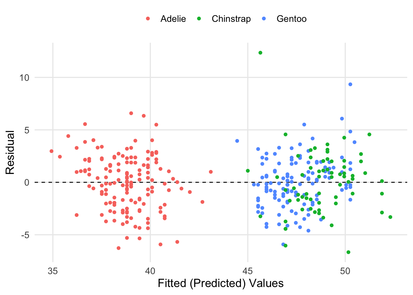
Here we can see that our fitted values have basically broken into two groups. However, this is a good thing! If you look at the previous scatter plots, you can see that the Adelie tend to have shorter bills on average, whereas the Chinstrap and Gentoo are more similar in this respect. It also seems like most of our predictions were within \(\pm5\)mm of the true values for bill length. We can get the specific estimate for residual standard deviation (\(\hat\sigma\)) and other information from glance().
bind_rows(Simple = glance(fit), Updated = glance(fit2), .id = "model") %>%
  mutate(across(where(is.numeric), round, 2)) %>%
gt::gt(rowname_col = "model")| r.squared | adj.r.squared | sigma | statistic | p.value | df | logLik | AIC | BIC | deviance | df.residual | nobs | |
|---|---|---|---|---|---|---|---|---|---|---|---|---|
| Simple | 0.43 | 0.43 | 4.13 | 257.09 | 0 | 1 | -968.98 | 1943.97 | 1955.47 | 5787.76 | 340 | 342 |
| Updated | 0.78 | 0.77 | 2.60 | 389.97 | 0 | 3 | -809.56 | 1629.12 | 1648.29 | 2278.34 | 338 | 342 |
Here I’ve taken the output for glance() from each model and stacked them2. By basically every criteria that’s reported in this output, our updated model is preferable to the simple linear regression. Our \(R^2\) has increased by a lot, and the values for logLik, AIC, BIC, and deviance are all smaller under the updated model, each suggesting a better fit. Of practical note, our value for \(\hat\sigma\) has decreased by about 1.5mm. While there’s still a fair bit of variability in the outcome, cutting down our average error is an improvement.
wrap-up
Whew, we’re done (at least with with what I’d initially planned to cover)! There are perhaps two practical items that I didn’t get to in the main text. The first is the topic of scaling numeric variables, which is often done after they’ve been centered (something I mentioned in my first footnote). Scaling a variable by its standard deviation can be helpful when you have many different predictors that are measured differently, and want to ensure you have the same interpretation for each of the coefficients. The second is the topic of including interactions in a regression equation. In the context of regression, an interaction between two (or more) variables exists when the relationship between \(y\) and \(x_a\) depends on \(x_b\) (or other \(x\)s). This topic is complex, and a whole separate post could be dedicated to defining, interpreting, and visualizing interactions. In the case of this series, I wanted to focus on the fundamentals of linear regression as an approach, of which interactions as a topic falls outside of scope.
If you’ve stuck with me through all 3 posts, thank you! I hope I’ve built on any prior exposure you’ve had to the topics, and connected your learning to practical tools in the R language. If you have any questions on anything I’ve covered, or spotted any potential errors in something I’ve discussed, please feel free to contact me!
This means that in different contexts, the intercept can be substantively meaningful. However, this depends on whether it makes sense for your research question to have all the values of your variables equal to 0 at the same time. Taking our data for example, it’s nonsensical to think of a penguin with a flipper-length of 0. This is why it’s often common practice to center numeric variables (i.e., taking each observation from a variable and subtracting the variable’s mean). Once done, setting the transformed variable to 0 is equivalent to setting it equal to its mean.↩︎
I’m also printing things a bit more cleanly using the
gt()function from the{gt}package.↩︎