Having broken my personal promise to not work with COVID data1, I decided to revisit the subject after seeing a recent project from Nathan Yau. Yau was looking at OpenTable reservations, and made a clean & well-annotated plot with panels for each state. The OpenTable dataset tracks the difference between seated dining on a given day between 2019 and 2020. Plotting these differences over time gives a view into how quickly people are returning to more regular consumption patterns. Yau’s work had deepened a sinking feeling I’d had since mid-June, when things started getting much worse in my state. Walking around Boise, regardless of the time, I was seeing so many people in restaurants (and bars, for the brief time they were open). It was eerie, knowing that things weren’t actually back to normal, and all I wondered was when we’d start seeing the impact.
At the end of last week, I saw another angle on this topic, summarizing an analysis of credit card spending.
JPMORGAN: “.. we find a positive correlation between levels of [credit-card] activity three weeks ago and the spread of COVID-19 since then.” Of all indicators, “the highest correlation .. is the level of “card-present” (essentially in-person) restaurant spending ..” pic.twitter.com/V5JE7edAEE
— Carl Quintanilla (@carlquintanilla) July 2, 2020
This relationship is interesting, but the single snapshot above wasn’t satisfying. The 3-week lag sounds about right, but checking differences at any single point feels arbitrary. I really want a sense for how this relationship would vary, given that people’s relative comfort with going into a restaurant is undoubtedly changing over time.
The OpenTable data has some limitations, and not every state is represented, but it seems like a viable way to take a closer look. Below, I’ve plotted the count of new daily cases vs. the total new cases from 3 weeks prior (per 1m people) on the y-axis2, and have the OpenTable percent-difference along the x-axis3. We’ll step through each day over the past month(-ish), tracking the simple linear fit.
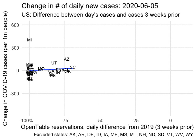
As with the credit-card data, the association seems to be positive, but only slightly. At several points we have some big outliers (e.g. AZ, FL, and RI), and there are a few days in which the relationship appears to either be flat, or non-linear. For a slightly different view, here’s the same data, but with all the data and lines in the same plot. Regression lines from more recent days will be colored darker.
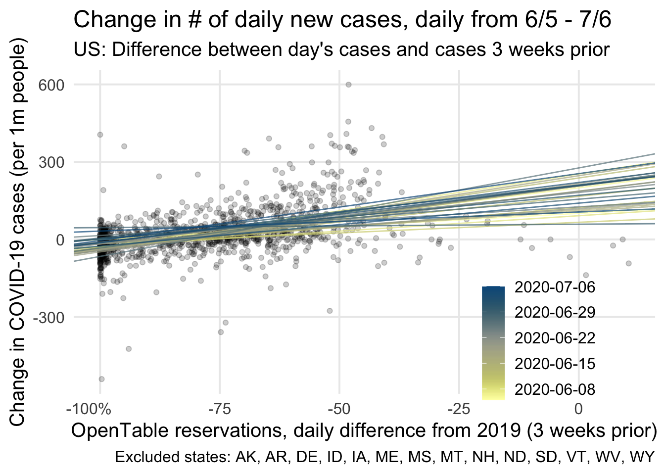
Hopefully this second view gives a better sense of how much the association varies. On average, the correlation between these two variables was 0.37 (range [0.03, 0.58]). This translates roughly to an increase of 1.9 cases/million people for each percentage increase in reservations. For example, if an “average” state saw a 50% increase in reservations 3 weeks ago, today we’d expect an additional 100 cases/mil above what was reported 3 weeks ago. In Idaho, a state with 1.78M people, this would mean an increase of 179 cases above what was reported 3 weeks ago.4 With many caveats warranted, it feels creepy to look at this, having watched my county go almost a full week of seeing over 100 new cases each day. I don’t know by how much Ada has moved back to what was normal for 2019 restaurant dining, but like I mentioned initially, there’s definitely more people out and about. I highly recommend take-out, if y’all really, really, don’t want to cook!
Earlier in June, oof. Also, now’s a good time to note that I’m not an epidemiologist, and that while I’m curious & can make graphs, my lack of expertise on this topic area should prompt caution on any interpretations presented here.↩︎
I used data from the NYT’s GitHub repo, and 2018 ACS 5-year population estimates↩︎
The OpenTable data is here: https://www.opentable.com/state-of-industry; reservations include diners that were seated using online & phone reservations, as well as walk-ins.↩︎
This granted I’ve done these analyses reasonably, my interpretation is correct, and that these estimates can generalize to states that weren’t included in the OpenTable data. The latter in particular may not be safe to assume. I really want to emphasize that this is speculative, and not conclusive.↩︎